Context
Project Catapult is the code name for a Microsoft Research (MSR) enterprise-level initiative that is transforming cloud computing by augmenting CPUs with an interconnected and configurable compute layer composed of programmable silicon.
The Microsoft Research team needed a series of projects for announcing an initiative known as Project Catapult at Microsoft Build 2018. The team at Specular was brought in to provide creative and build several deliverables for the announcement.
Project Details:
Motion Graphic 1:Azure Accelerated Machine Learning with Project Brainwave
Motion Graphic 2: FPGAs in Microsoft's Intelligent Cloud
PR Images
UI interface for Demo app
Motion Graphic 1
Azure Accelerated Machine Learning with Project Brainwave
Style-frames
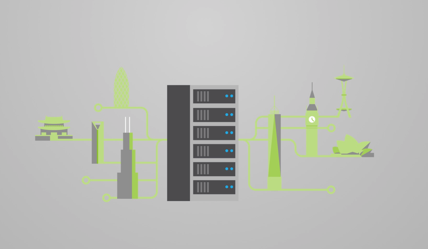
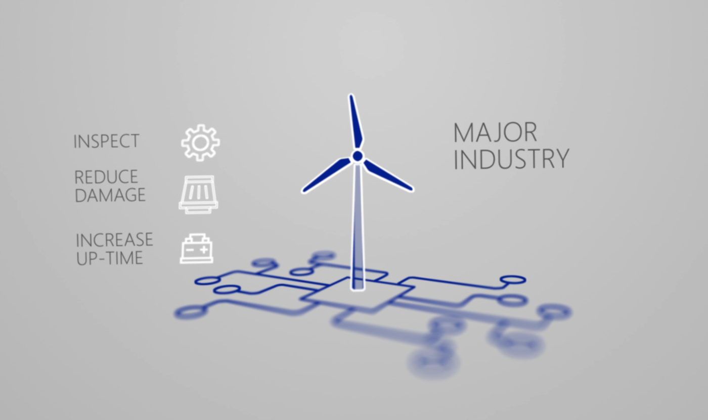
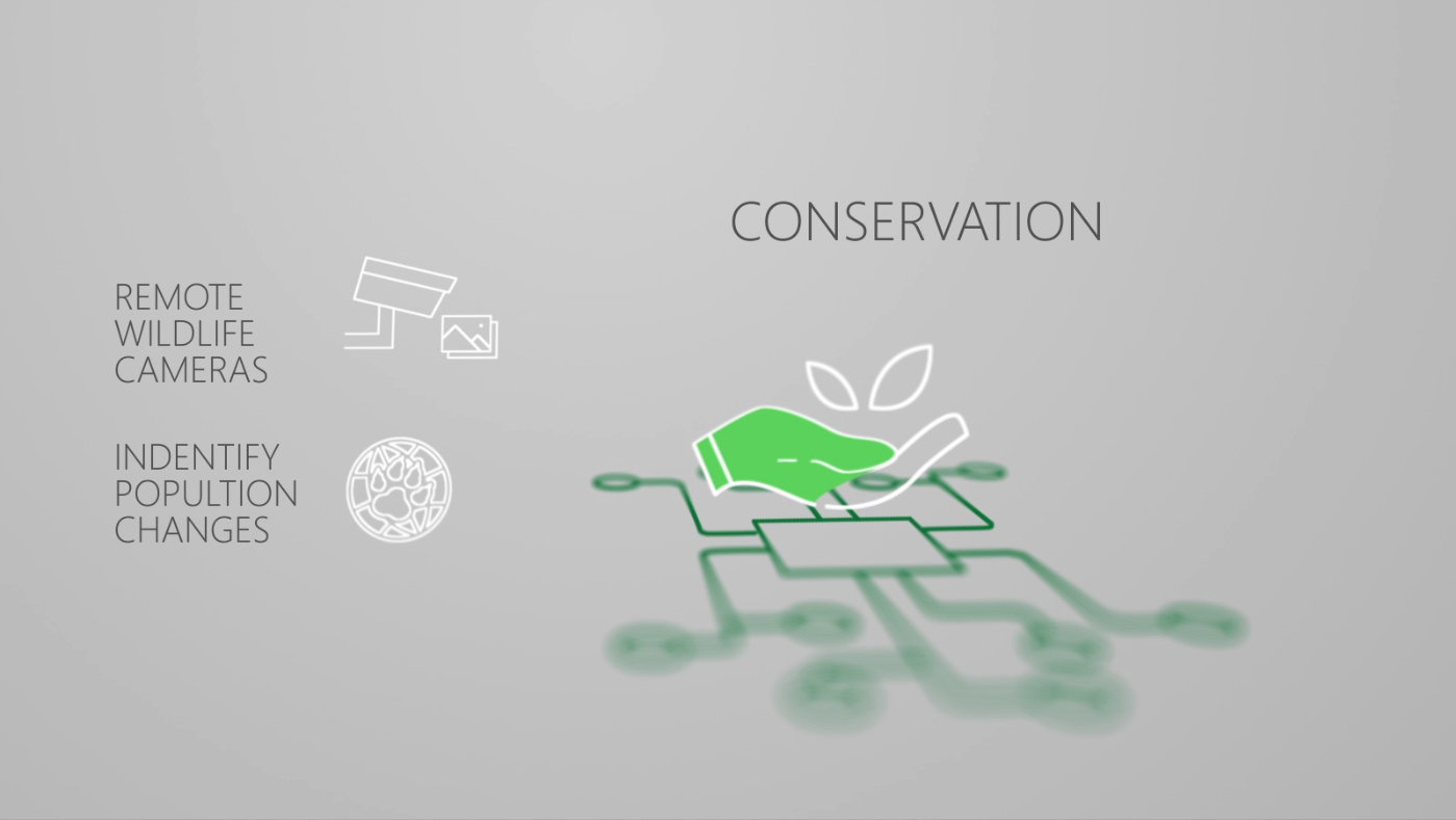
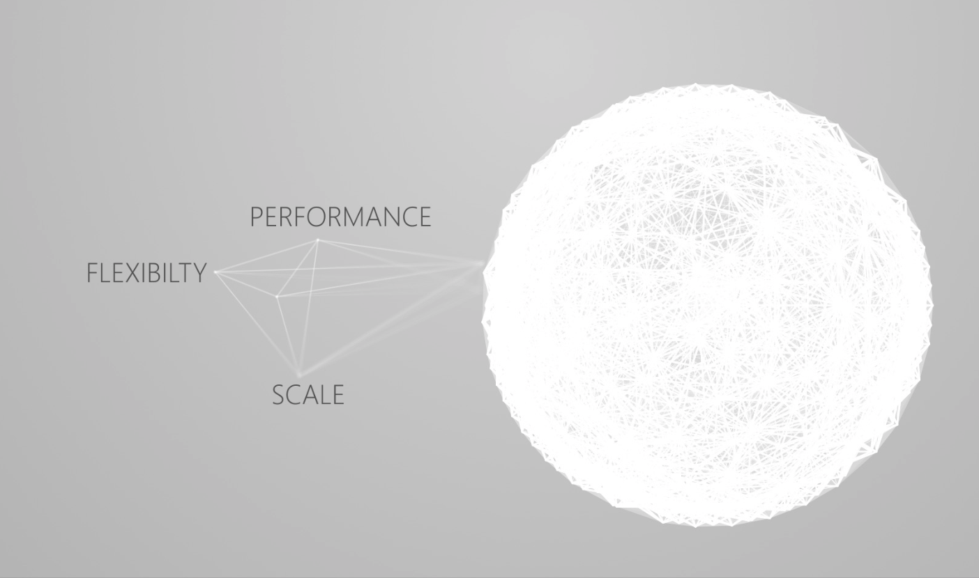
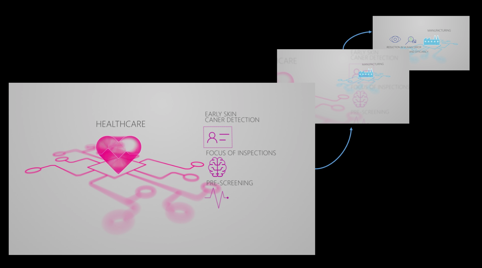
We built a series of style-frames that were created off of a monoline approach, during this process it helped us map our script to visuals and start planning more refined assets.
Storyboards
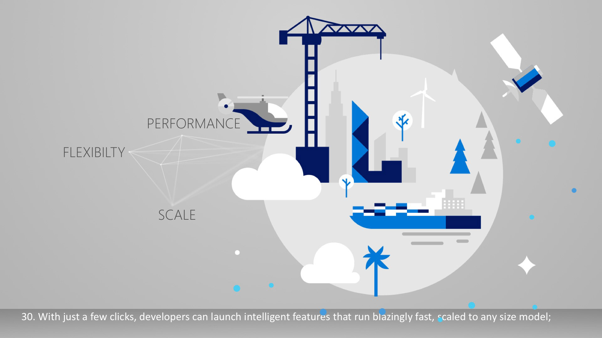
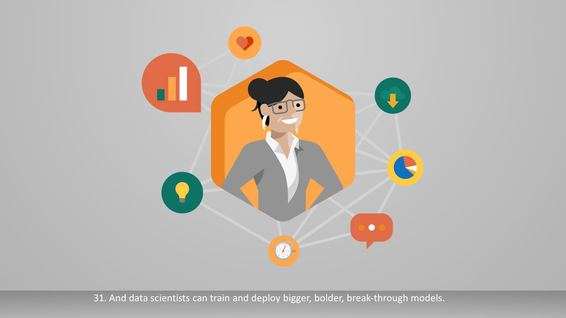
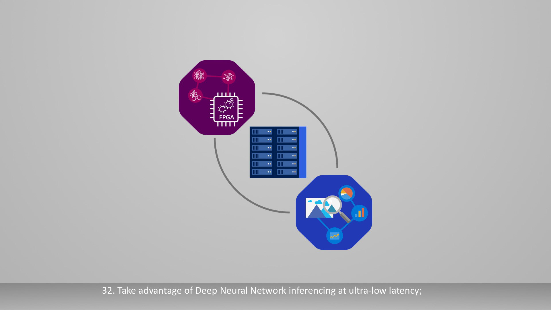
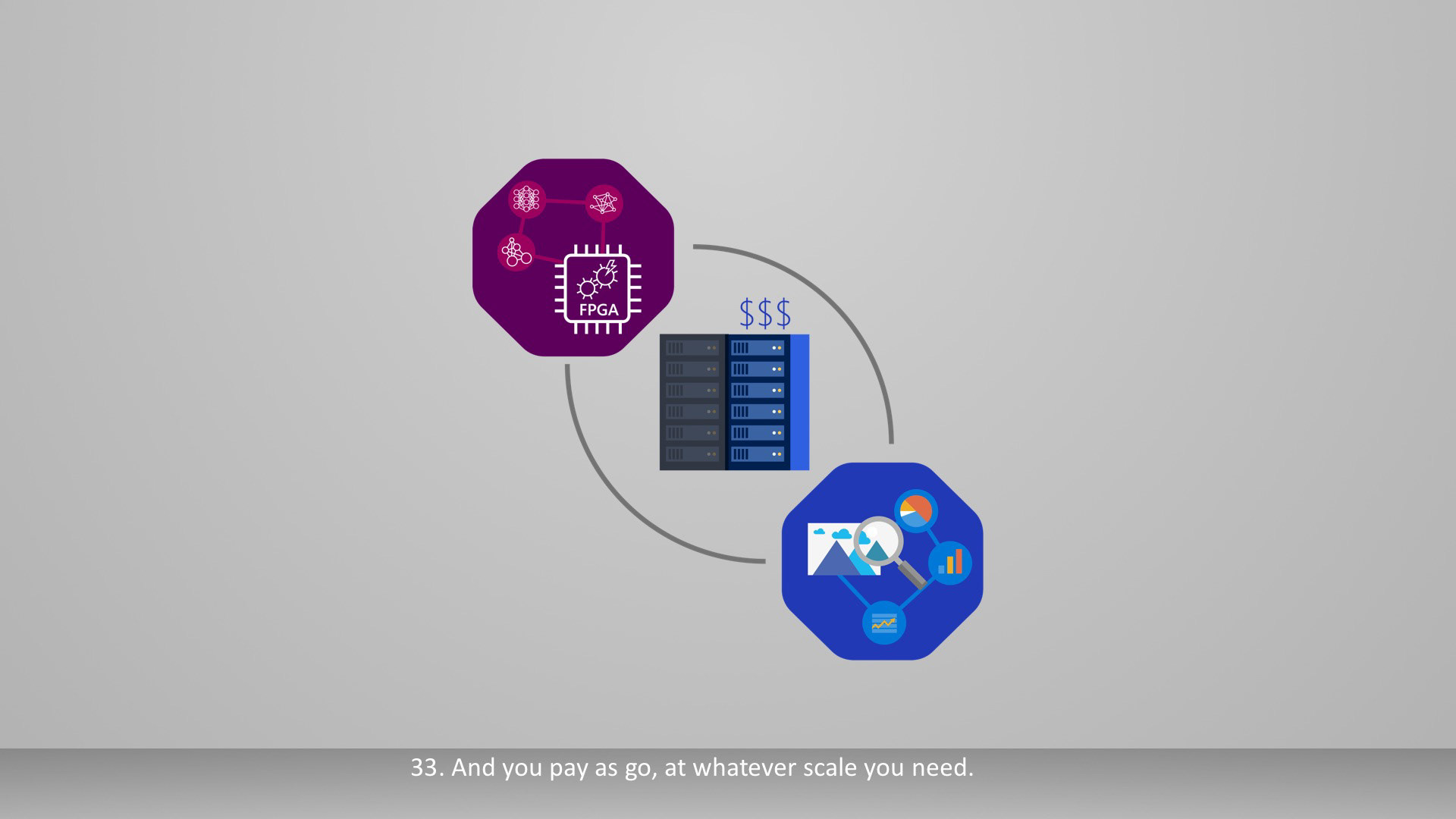
We dropped the monoline assets and started building the storyboards in the newer design language of Microsofts brand assets.
The Build
The words in the script were still being revised but the main story flow was set; at this point I started preparing scenes for motion and building rigs that could be retimed when the final voiceover was recorded.
I assembled and built assets in adobe illustrator and used overlord to import scenes
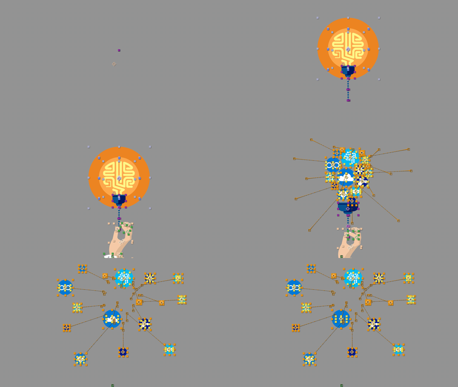

I started building rigs in Adobe After Effects to be retimed when the final VO was completed
Final Motion
Motion Graphic 2
FPGAs in Microsoft's Intelligent Cloud
Style-frames
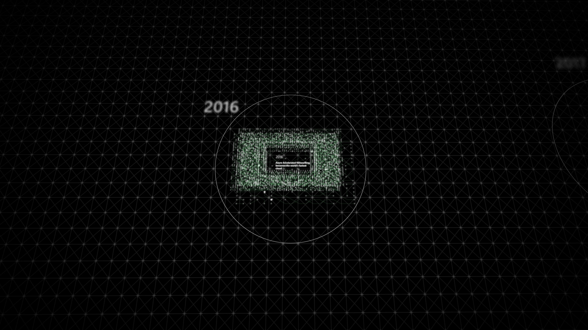
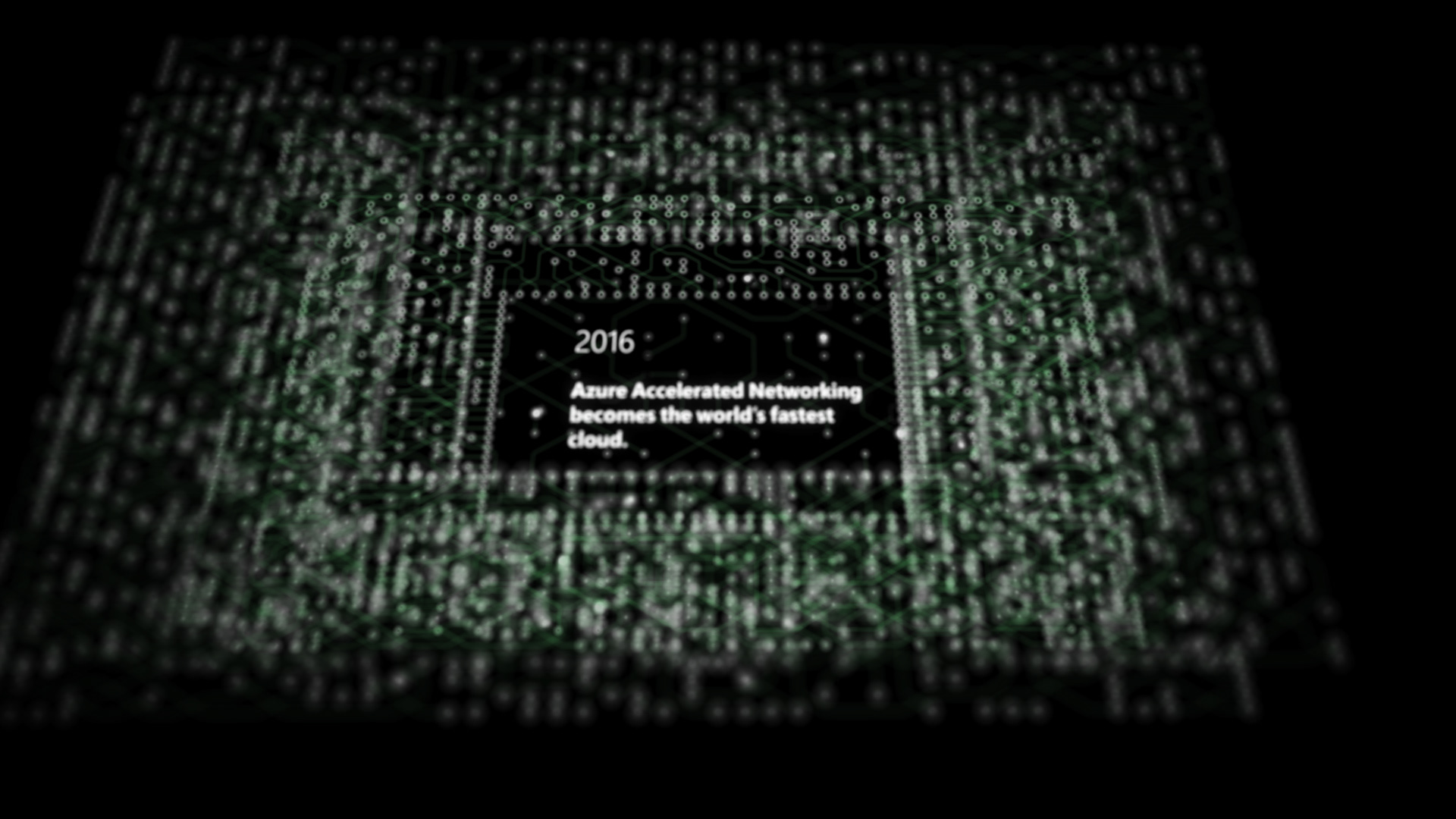

The original style-frames really gave the project a direction and helped the script evolve into the final piece. We knew from the style-frames that we wanted to convey "the timeline scene" in a series of circuit boards tied together with a shallow depth of field with lots of z falloff.
Storyboards
The Project Catapult team liked the direction we were going in, We built a final set of boards to inspire confidence that we could pull this process off in such a short timeline. During this design phase we decided to build a simple rig that would help us tackle the entire motion graphic. We also found the look we were going for with the Azure blue and the network cloud and circuits.

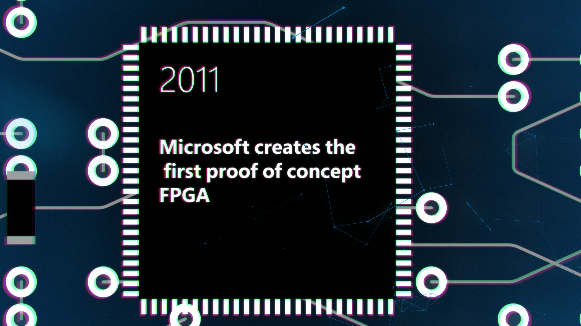
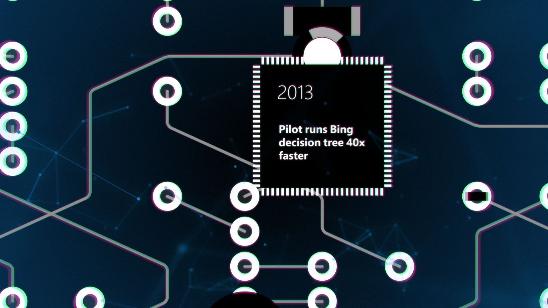
The final boards helped us find the depth of field, chromatic abrasion, and overall tie in with Azure Branding to allow us to move onto the next phase of the project
Building the asset army
With the look and a script almost locked we started to build as many assets and rigs as possible. Timelines are getting shorter with Build 2018 under a week away so we spent every waking moment building processors, circuit boards, and any other design systems. Once the script was locked and we could record the voice-over, the team would be ready to assemble in time with the high quality standards we give our clients.
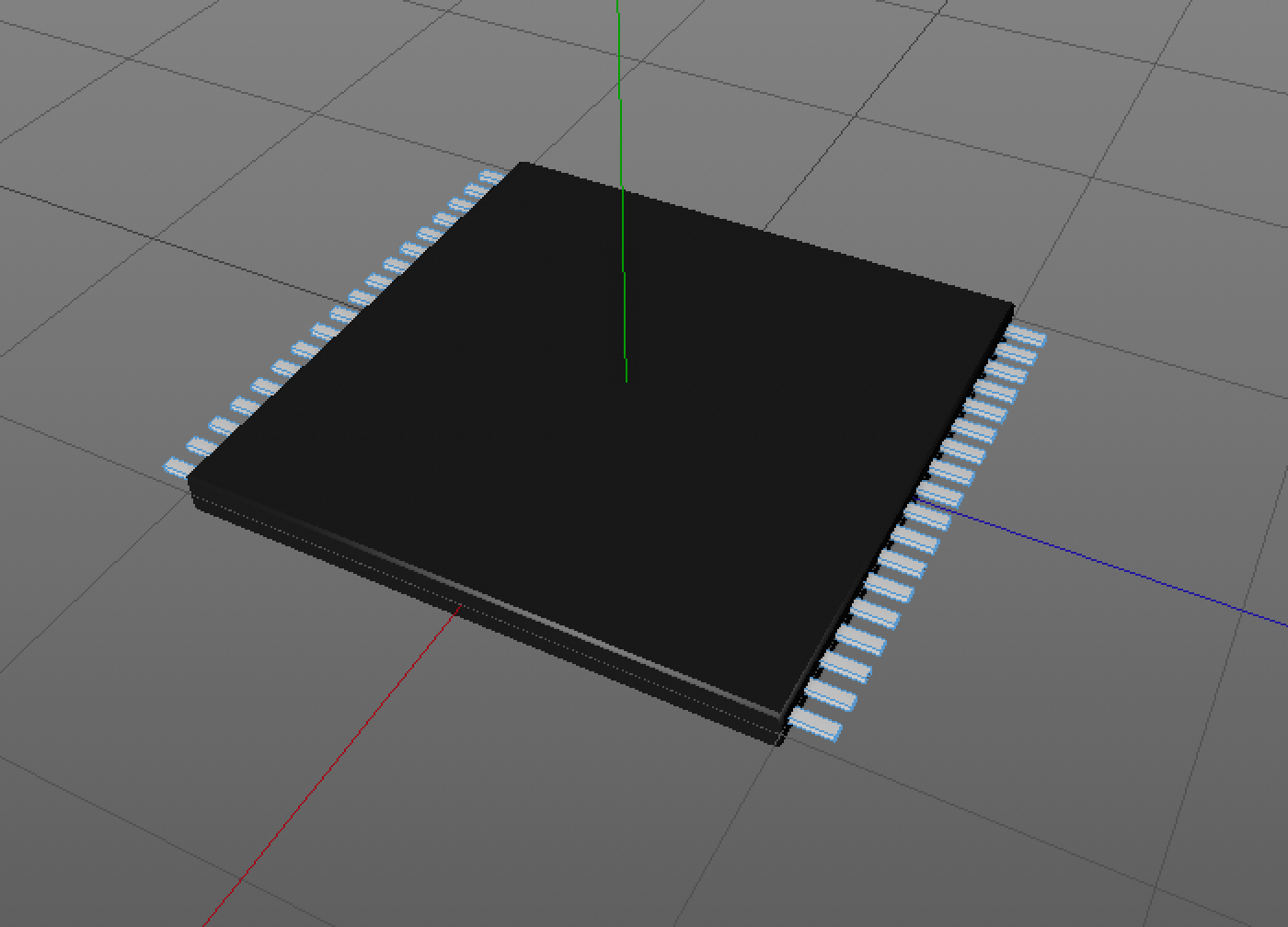
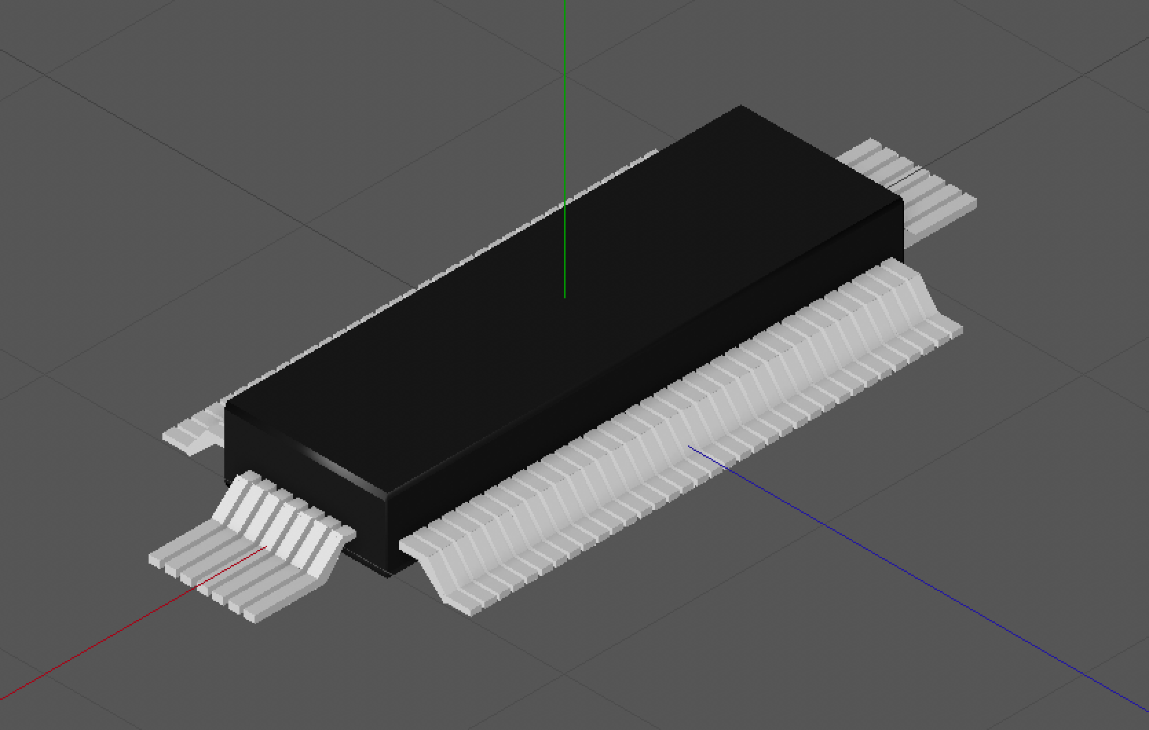

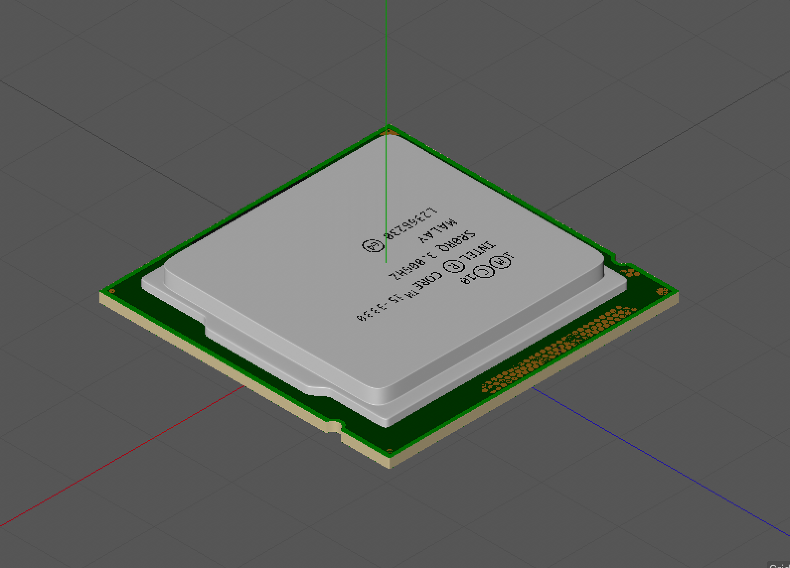

We built low poly 3D circuits and chips in Cinema 4d
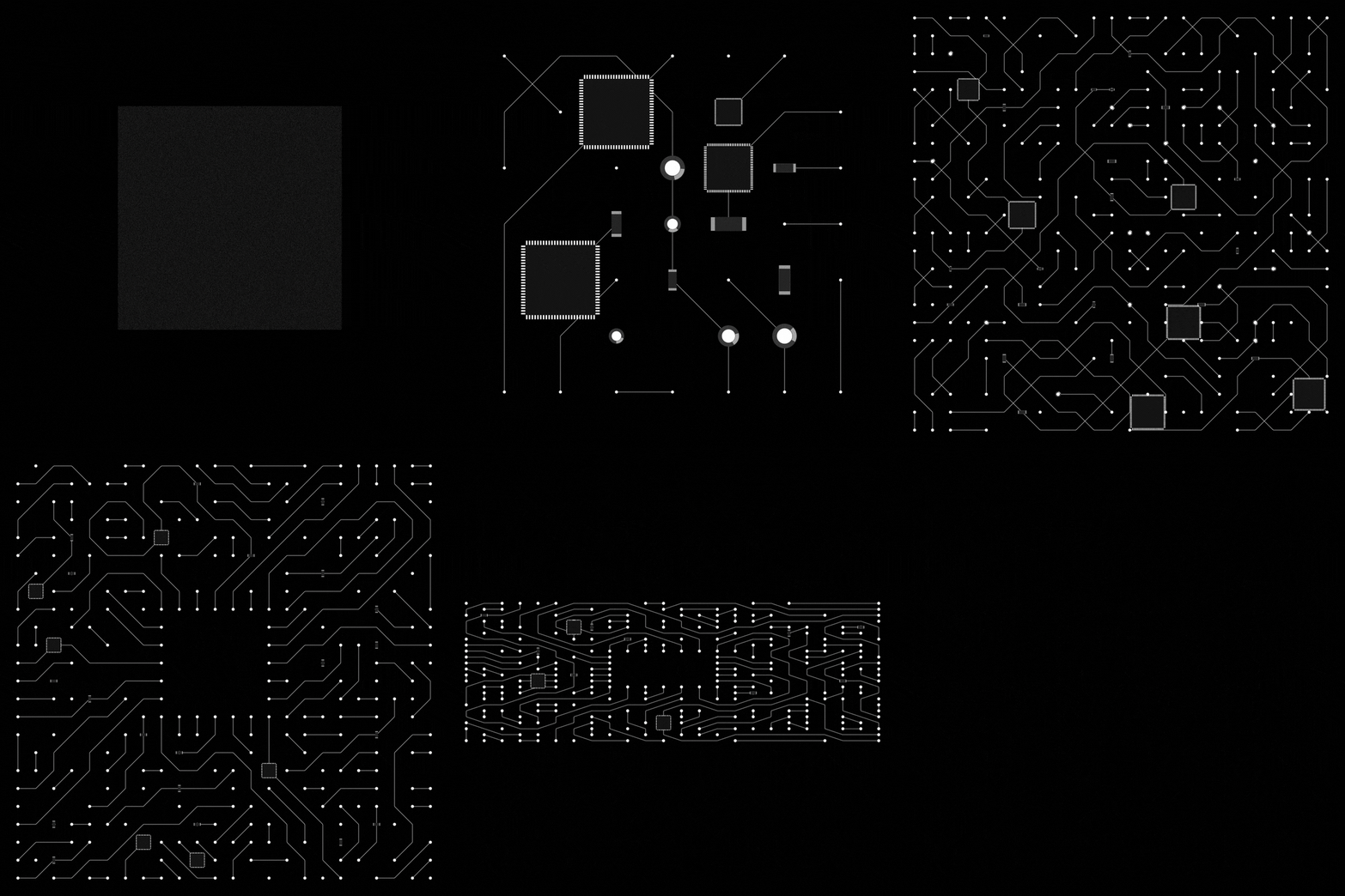
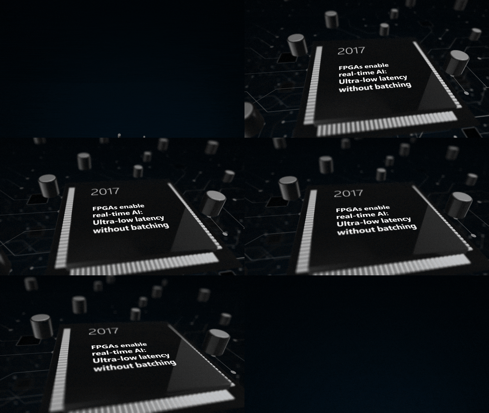
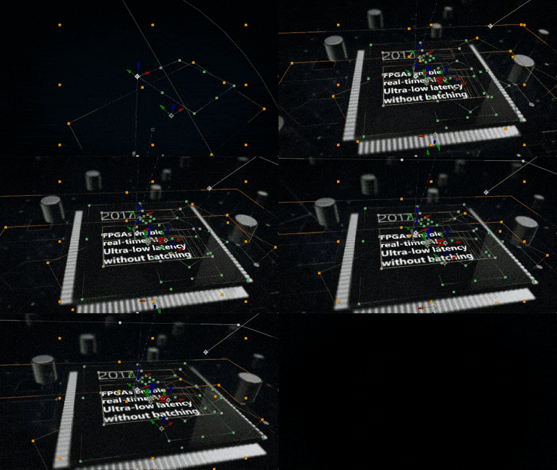
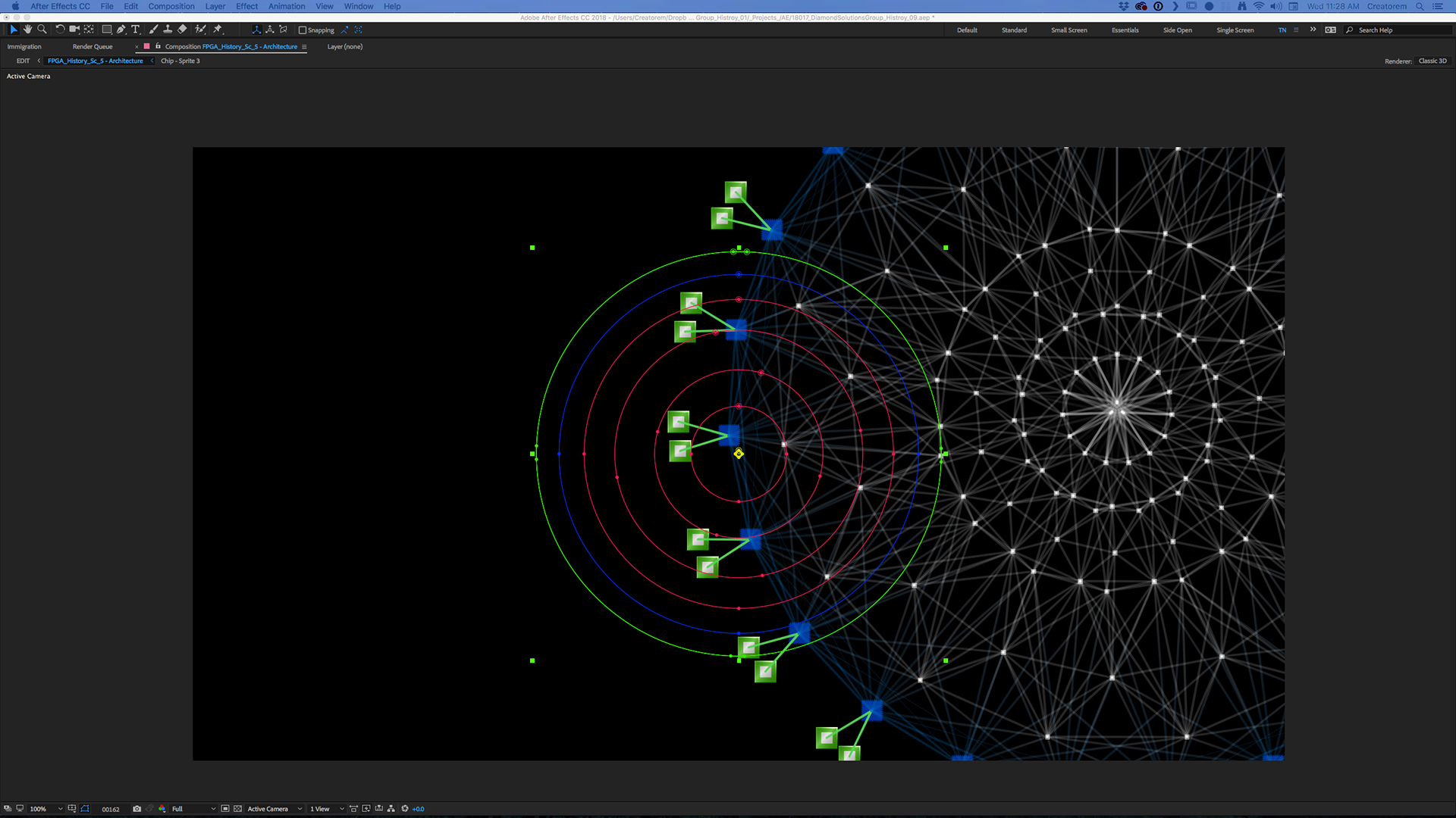
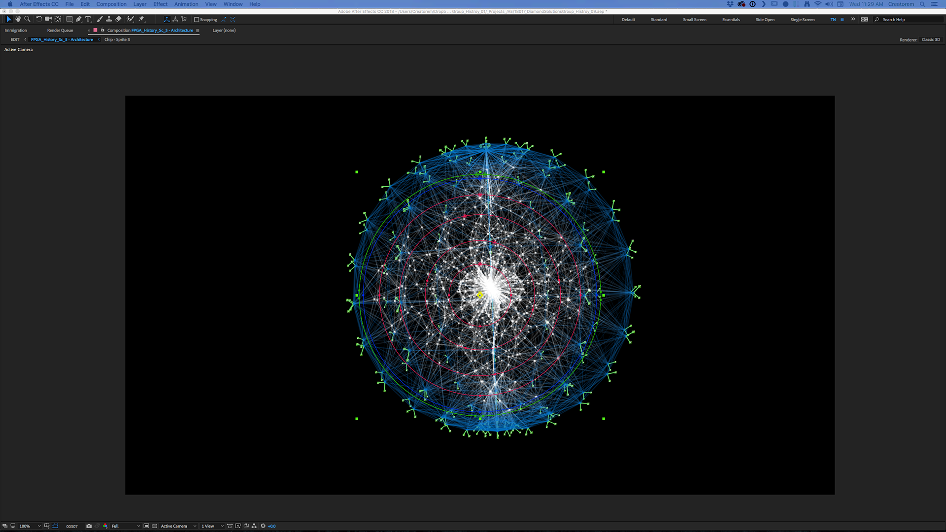

We created several circuit boards in illustrator and after effects to create z depth and used Element 3d to import the 3d assets. This allowed us render inside of After Effects to save valuable time.
The Build
Once the Script was locked and the Voiceover was Produced by Rachel, Tim and I locked ourselves in dark rooms and started compiling the 18 scenes we built in pre production. This was a really smooth project because the creative really nailed the vision of the MSR team and while the story was being finalized we spent the time to build rigs for each scene.
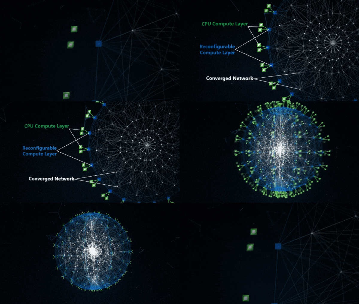
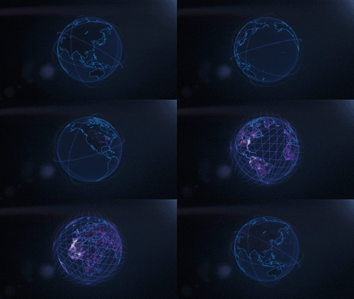
Tim tackled this parts above and really knocked them out of the park leaving me the timeline scenes and the Call to Action
The Call to action was a ton of fun to animate, it was the most fun I had on the entire project
Final Motion
User Interface Design
Jabil Test Application
I was asked to redesign the UI for the Jabil test application that was announced at Build 2018.
this was the original design of the Jabil test application
I created several boards during the iteration phase of the design process
Above is one of my favorite designs during the iteration process, since the demo was built in win-forms we had to drop the acrylic background. The demo also needed to be started and stopped per each bucket with a possibility of a new bucket being added in the future so the master control also had to be dropped.
This is the final design for the main page of the Demo
This is the final design for the results page of the Demo
PR Images
Marketing Images for Web
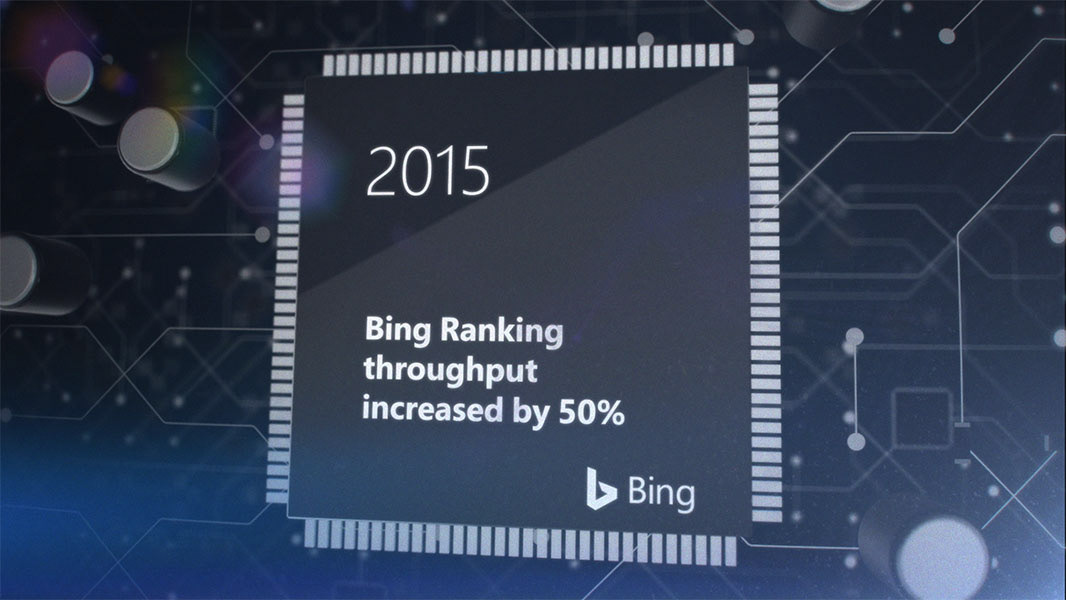


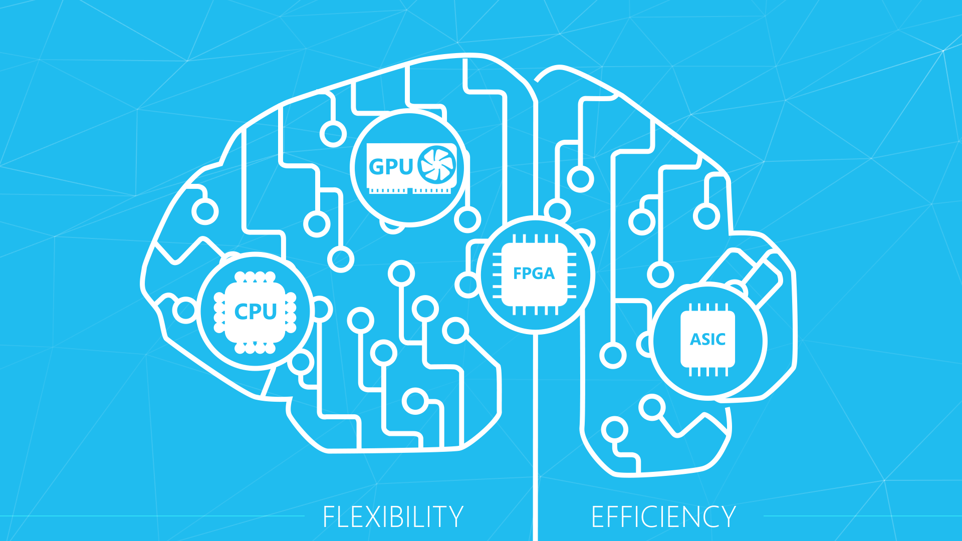

We rendered out a series of marketing images to be used on the web
Please check out the final project at:


